

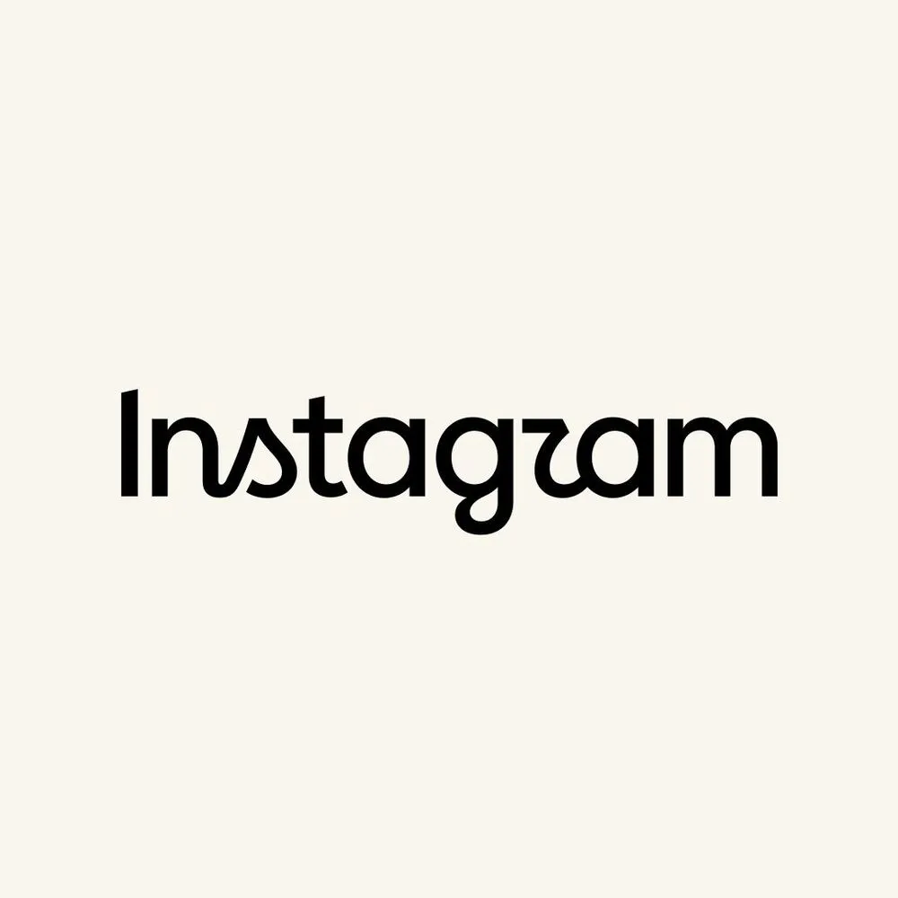
In 2013, Mackey Saturday, a typographer from Denver, Colorado, said he wanted to make Instagram's logo lettering into a "timeless script" that could stand alongside Coca-Cola and Kellogg's. Saturday, a friend of co-founder Kevin Systrom, spent over a year hand-redrawing the Billabong font—inspired by 1950s surf culture—into more flowing lines. Speaking to Gizmodo, Saturday said, "The real goal is to be up there with the timeless scripts like Kellogg's and Campbell's. Coca-Cola is also a great example—it's nostalgic yet transcends trends."
True to those words, this script remained at the top of the screen as the face of Instagram for over a decade. On August 13, 2026, Instagram replaced that lettering with its own hands.
A "Timeless" Typeface Reaches Its Expiration Date After 10 Years
Instagram head Adam Mosseri explained the reason for the change in a post on Threads: "The wordmark at the top of the app hasn't changed in 10 years, so it was time for a refresh." While describing the new logo as "Cleaner and more modern," he stated that it retains references to the original and preserves "simplicity and craftsmanship."
A wordmark refers to a logo that stylizes a company or service name using only text, as distinct from a symbolic icon like Apple's apple mark. In Instagram's case, the pink gradient icon conveys "which app this is," while the wordmark conveys "what this service is called." Within this two-layer structure, the icon has changed twice, but the lettering had never changed—until now.
Looking back over the past decade, Instagram's visual identity has been updated in stages. In May 2016, the company replaced its app icon—known for its brown retro camera and rainbow stripe—with a flat design featuring a pink-to-orange gradient. This sparked a backlash so significant that The New York Times dubbed it "The great Instagram logo freakout of 2016." Adweek called the new logo a "travesty," while The Guardian went so far as to describe the old Polaroid camera icon as having been "murdered, its chalk outline drawn around it." In May 2022, Instagram unveiled its proprietary typeface, Instagram Sans, updating the visual system across the entire brand. However, the wordmark at the top of the app remained the same script created by Mackey Saturday in 2013—until now.
A point came where remaining unchanged itself became a risk. The typeface of the new wordmark incorporates the curves of the old cursive script into the letters s, r, and g. This raises a cultural question. Opportunities to learn cursive in school are rapidly declining among younger generations. In the United States, many states have removed mandatory cursive instruction from their curricula. A survey conducted by a Seton Hill University professor during a 2022 class found that about two-thirds of students said they could not read cursive. The reason Coca-Cola's script logo was considered "timeless" was simply that the majority of people at the time could read it. A typeface that cannot be read risks becoming noise rather than a brand asset.
A Design Decision That Returned to Script After Hundreds of Candidates
According to Meta's news release, the design team considered hundreds of candidates, ranging from all-caps proposals to designs that preserved raw handwriting as-is. In the end, the team kept circling back to script typefaces.
Instagram's Director of Product Design, Jasmine Probst, described the design philosophy in the same release: "Script reflects individuality, so referencing that felt right. The new wordmark is bolder, simpler, and adds an unexpected touch. It evokes personal expression and personal voice—both of which have remained at the core of Instagram."
Behind this decision lies a tension Instagram faces as a platform. Amid intensifying competition with TikTok, Instagram has pushed forward its identity as a "space for creative self-expression." The sense that script—handwritten lines—conveys, that "each person is different," structurally overlaps with this direction. The homogeneity of sans-serif typefaces or the impersonal nature of all-caps text cannot tell this story.
Alongside the wordmark refresh, Instagram has also expanded its typographic ecosystem. In addition to replacing the existing Instagram Sans with an updated version, the company is introducing a new handwriting-style typeface called Instagram Pen and a monospace font called Instagram Mono. This reads not as a mere touch-up of a single wordmark, but as a move to rebuild the entire brand's typographic environment.
| 2013 Wordmark | 2026 Wordmark | |
|---|---|---|
| Typeface direction | Pure script reconstructed by hand by Mackey Saturday from Billabong | Hybrid script fusing handwriting and print typography |
| Design goal | "Lettering timeless enough to stand alongside Coca-Cola and Kellogg's" | "Bolder, simpler, with an unexpected touch" |
| Number of candidates considered | Unknown (Saturday created it individually at Systrom's request) | Hundreds (ranging widely from all-caps to handwriting) |
| Elements changed simultaneously | Wordmark only | Instagram Sans updated, Instagram Pen and Instagram Mono added |
| App icon | No change (brown camera at the time) | No change (gradient maintained) |
"Instagzam" Reflects the Tradeoff Between Legibility and Individuality
Immediately after the announcement, a joke spread across social media: "Instagzam." The point being that the r-shape in the new font resembles a z, making it readable as "Instagzam" rather than Instagram. A TechCrunch reporter touched on this reaction while writing that "the Instagram brand name is well-known enough that most people will quickly understand what it says."
However, the reactions on social media contain more than just jokes. Legibility and distinctiveness are always in a tradeoff relationship in typographic design. The more distinctive a typeface becomes, the harder it is for first-time viewers to read. When Instagram Sans was introduced in 2022, similar complaints flooded social media—people saying it was "hard to read" and asking "why use a font like this?" At the time, an Inverse reporter asked regarding the script variant of Instagram Sans, "Could a 10-year-old read this r?"
The same question is being repeated with this new wordmark. TechCrunch described the shape of the s as looking "like a small sailboat's sail," but for users who never learned cursive, intuitively recognizing that curve as an s is difficult. In pursuing individuality, the most basic function—reading the brand name—becomes shaky. This is less a design mistake than a cost inherent to the design decision itself.
Logo Controversies Always Happen. What Matters Is What Comes After
Backlash over brand logo changes is not unique to Instagram. In July 2023, when Elon Musk replaced Twitter's blue bird with X, graphic designer Jan Šabach told TIME that the new logo felt "cold and pointy," pointing out a lack of strategy in the brand transition. Airbnb's 2014 "Belo" logo was mocked on social media for resembling parts of the human body.
However, as Instagram's own experience in 2016 shows, initial backlash tends to fade over time. The gradient icon that The New York Times called a "freakout" is now one of the most recognized app icons in the world. A 2026 retrospective article published by Creative Bloq, looking back a decade later, states: "The ultimate proof of that rebrand's success is that we can no longer remember the old logo."
Whether this wordmark refresh will follow the same trajectory remains to be seen. Meta did not respond to TechCrunch's inquiry about whether changes to the app icon are planned. When the new wordmark will roll out to all users also remains undetermined.
The question that remains extends beyond the world of design. When generations who cannot read cursive become the majority, who is a brand strategy that references "handwritten warmth" actually speaking to? The shape of the lettering seen daily by over a billion people is not only an aesthetic choice but also a choice of cultural assumptions. Will the script Instagram has chosen prove "timeless"—or will people say ten years from now that it was again "time for a refresh"? The answer still lies ahead.