

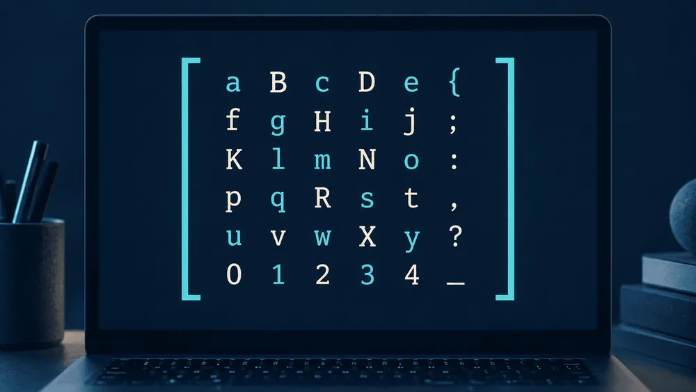
Intel has retracted its notice that the developer monospace font "Intel One Mono" project was ending. On September 7, 2026 (UTC), a notice announcing the end of maintenance and updates was added to the official repository, but it was withdrawn on September 9, and as of September 14 the repository's archived status has also been lifted. A font shaped by input from low-vision developers can once again be improved through the official project. However, no new release or future development structure has been announced, so the conditions for continuing to use the existing font need to be considered separately from the conditions for improving it while keeping it readable.
The shutdown notice was withdrawn two days later, with no new release announced
The original notice stated that Intel would neither provide nor guarantee development or support for the project. It covered maintenance and bug fixes as well as new releases and updates, and it said Intel would not accept patch submissions. For those who wanted to keep using or developing the font, it urged them to fork it, that is, to copy it and grow it as a separate project.
That notice was removed in the official revert commit. The September changes consisted of adding and then retracting the shutdown notice, and the latest release remains V1.4.0, published on July 26, 2024.
| Date (UTC) | Change in the official history | What it means for font users |
|---|---|---|
| July 26, 2024 | V1.4.0 released | Added optional ligatures and box-drawing characters, and fixed minor bugs |
| September 7, 2026 | Shutdown notice added to the README | Announced a policy of providing no development or support, and an end to accepting patches |
| September 9, 2026 | Shutdown notice reverted | The change affected the README only; no font files were updated |
This table lines up Intel's release date and commit dates, and was checked on September 14, 2026. It does not show the exact time at which the GitHub archive setting was changed. The revert commit also does not state why the notice was withdrawn or whether any updates are planned.
According to GitHub's documentation, archiving a repository makes its code, issues, and pull requests, such as proposed bug fixes, read-only. The project is not deleted, and it can still be forked. Describing the retraction as the font being saved from the brink of disappearing would therefore misjudge the impact on users.
The 2025 September change was likewise only an update to the explanation of the hinting source in the README. Recent commits and updates to the font itself need to be viewed as separate things.
It does mean something that the official project is again in a state where it can accept updates. But the fact that the notice was deleted does not mean that ongoing maintenance or the release of a next version has been promised.
A design for easy recognition, built with low-vision developers
Intel One Mono was developed by Intel's brand team and VMLY&R in collaboration with Frere-Jones Type, which handled the typeface design. At each stage of the design, input was gathered from the people it is meant for, including low-vision developers. Although it is a monospace font, in which every character occupies the same width, it is distinguished by making the shapes of similar-looking characters clearly different from one another.
Intel's design explanation says the font makes forms that are easily confused with other characters, such as the lowercase "e" and the uppercase "G," easier to tell apart. The shapes of brackets and slashes are also emphasized. The aim is to make symbols easier to spot when reading code and to reduce the burden of looking back to check them.
There are also touches in character height. Rather than aligning lowercase letters to a uniform tall height, the design creates a difference in height from the capitals and lengthens the parts that extend above and below. The idea is to differentiate not only individual characters but also the outline of whole words. Intel states that the goal is to reduce eye strain and coding mistakes, but this is an explanation of design intent, not a guarantee that every user will see the same effect.
The current V1.4.0 supports more than 200 languages that use the Latin script and includes 1,043 glyphs. It comes in four weights, from Light to Bold, each with an italic. Because "more than 200 languages" does not include Japanese kanji or kana, anyone working in an environment where Japanese comments are also read will need to supplement it with a separate Japanese font.
To try it, use the released files guided by the official README. OTF or TTF is recommended for desktop use, and WOFF and WOFF2 are provided for the web. In VS Code, just specify "Intel One Mono" as the font name.
The programming ligatures added in V1.4.0 display multiple symbols combined into a single glyph, and they are disabled by default. To use them, enable the OpenType feature "ss01" in a supporting editor. In VS Code, set "editor.fontLigatures" to "'ss01'". Because ligatures can be switched on or off, you can also try the font's distinguishable letterforms while keeping familiar symbols displayed as they are.
Free to modify, but reproducing on-screen rendering takes effort
Intel One Mono is published under the SIL Open Font License 1.1. As long as the license terms are followed, it can be used, modified, and redistributed, and it may be embedded in software. Separately from how the official project is run, there are terms in place for using the distributed font and, if necessary, developing it yourself.
There are conditions on free modification, though. The font cannot be sold on its own, and when redistributed it must include the copyright notice and the license, with the font itself distributed under the same license. In addition, "Intel" is designated a Reserved Font Name, so using it as the primary name of a modified version requires written permission from the rights holder. Documents created using the font do not have to be published under this license.
For those taking over improvements, there is another practical problem. Being able to edit the outlines of characters is not the same as being able to reproduce the same on-screen rendering as the official version.
The published UFO-format files are sources for editing character shapes and font information; they are not fonts that can be installed as they are. In addition to the sources for each style, data is provided for editing the designs at the extremes of the weight range and generating the intermediate weights. The materials for remaking the typeface itself are all there.
On the other hand, the official TTF and web files have manual hinting applied to refine how they appear on screen. Hinting is information that adjusts how character outlines are drawn to fit the screen's pixels. When reading small text, it affects clarity of display as much as the outline design does.
The "Hinting Source" section of the README states explicitly that this TrueType information is not included in the UFO files. It recommends using auto-hinting when rebuilding the font from the UFO files, but notes that the on-screen rendering will not be identical to the official version. A separate TrueType source exists for editing the manual adjustments, and it can be handled with Microsoft VTT.
In other words, both the right to make derivative versions and the sources needed for the work are public, but keeping the same readability still requires work on both the outlines and the display adjustments. Simply creating a fork does not remove that effort. Precisely because this font was made for easy recognition, the question of how to carry its display quality forward matters.
With the shutdown notice retracted, existing users have no need to rush to replace the font. If fixes are later incorporated into the official project and distributed as a new version that includes display adjustments, users will be able to receive those improvements without having to rebuild the font themselves.