


At its annual developer conference (WWDC 2025), Apple announced a sweeping design overhaul spanning its entire operating system lineup. Its name: "Liquid Glass." This marks the first fundamental shift in visual language in over a decade since the flat design introduced with iOS 7 in 2013—and it's far more than a mere cosmetic update. It can be seen as a strategic move looking ahead to the next decade, laying the groundwork for the future of computing that Apple envisions, particularly the user experience underpinning spatial computing.
What Is "Liquid Glass"? — The Core of the New Design Language
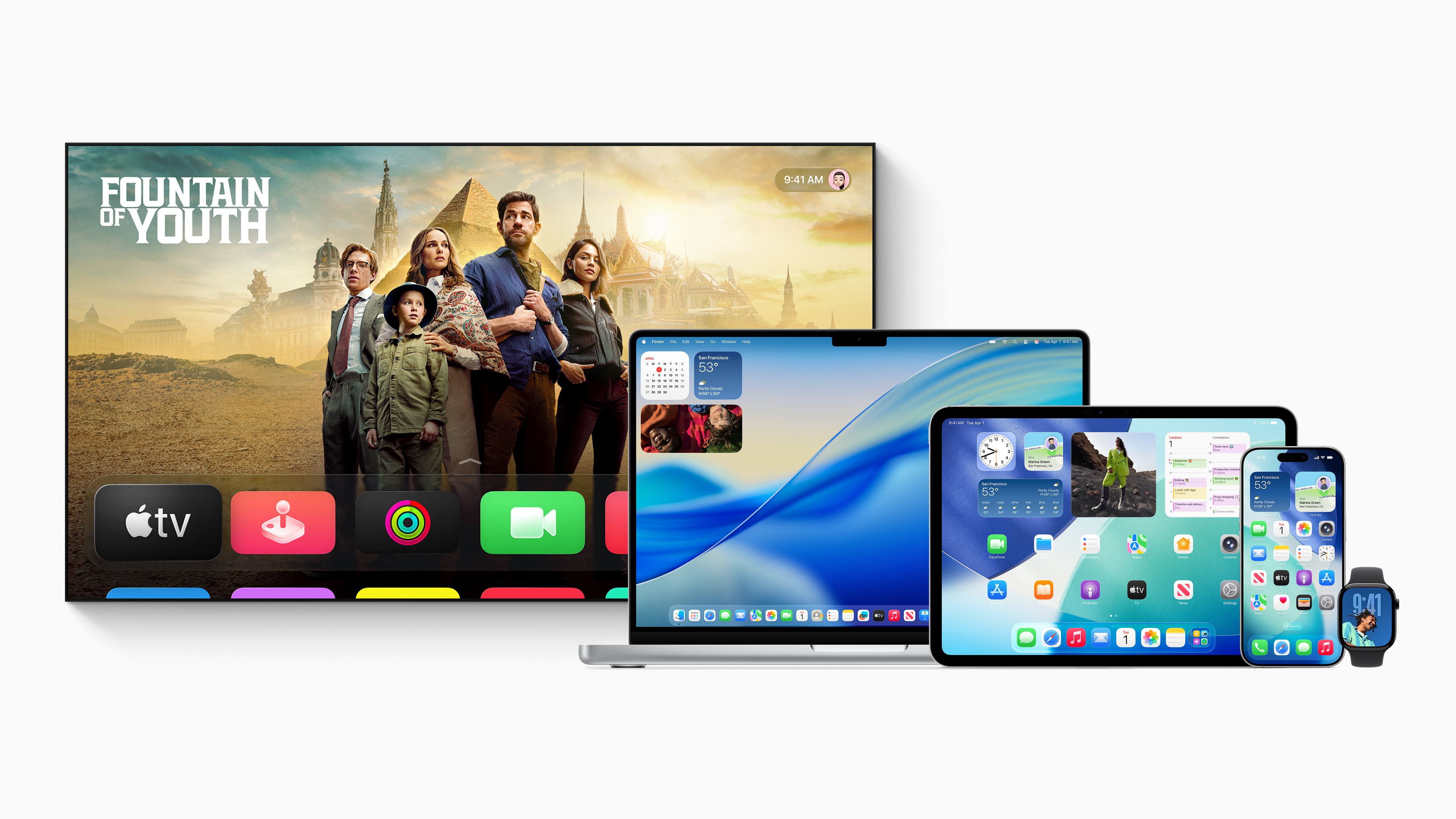
As its name suggests, "Liquid Glass" is a new design language built around the concept of "liquid glass." As Alan Dye, Apple's Vice President of Human Interface Design, described it, this is "the broadest software design update we've ever done," and its scope extends across Apple's entire ecosystem—iOS 26, iPadOS 26, macOS Tahoe 26, watchOS 26, and tvOS 26.
The "Glass Texture" Inherited from visionOS
The source of inspiration for this new design lies in visionOS, the operating system for Apple's spatial computer, the Apple Vision Pro. Liquid Glass brings the optical properties of real-world glass—translucency, light refraction, and similar qualities—into the digital interface.
UI elements become translucent, subtly reflecting the colors and light of the content behind them. This creates depth and context throughout apps and the system as a whole. For instance, on the Lock Screen, the time display is rendered in Liquid Glass and fluidly deforms as it wraps around the subject in the wallpaper photo behind it. It's an experience where the interface truly merges with the content.
A "Living" Interface That Changes in Real Time
The true essence of Liquid Glass goes beyond a static glass-like effect—it lies in its dynamic nature. According to Apple's official announcement, the design leverages "real-time rendering" technology to dynamically respond to a user's movements or the tilt of the device with "specular highlights."
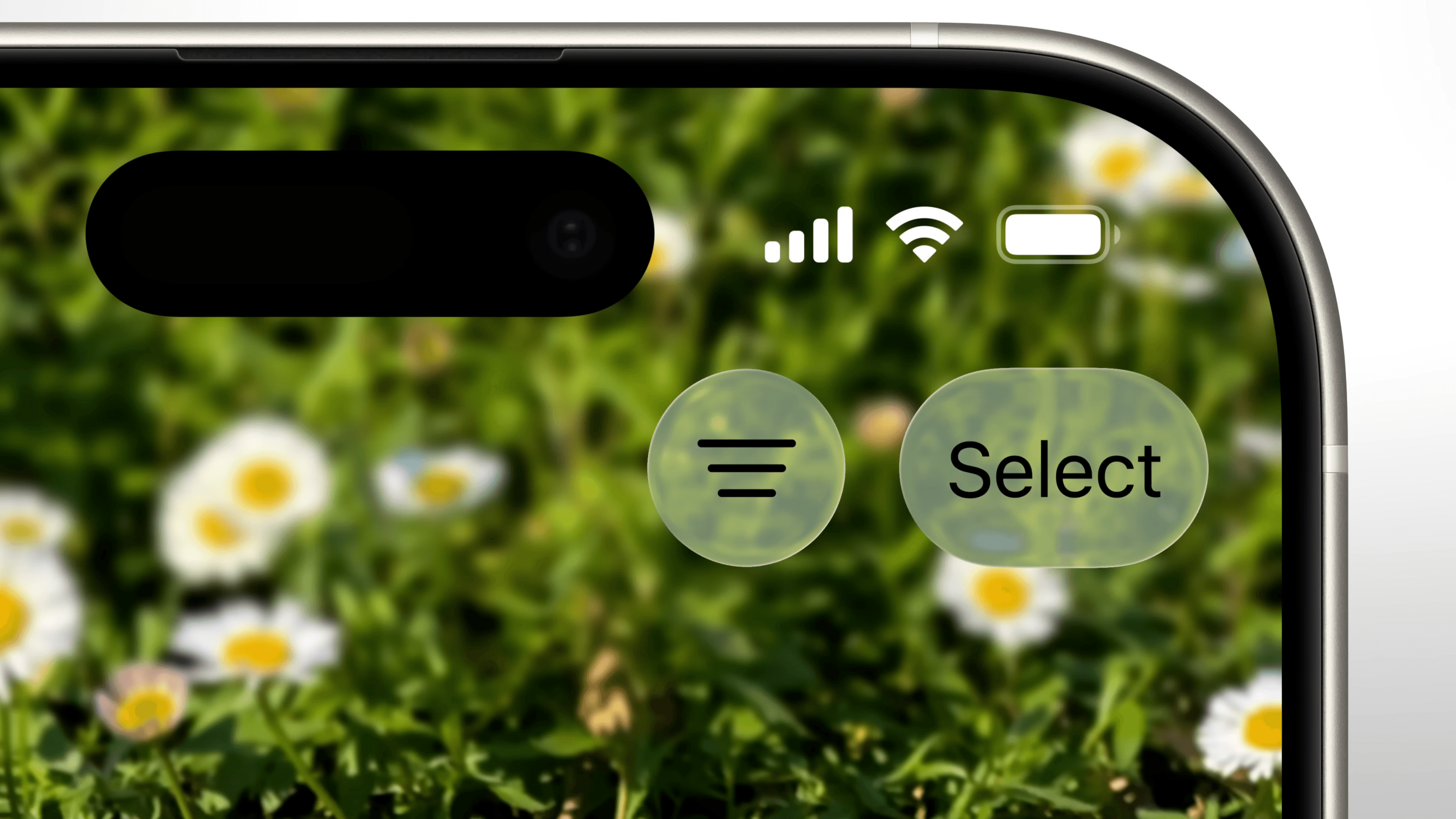
This means UI elements reflect light and shift their sheen as if they were alive. Tapping a button causes an alert to appear as though light were spreading outward from that point, and context menus expand smoothly as you scroll. Each of these interactions, powered by the strong graphics performance of Apple Silicon, is designed to feel more intuitive and delightful.
The Biggest Change Since iOS 7 — What's Different, and How?
In 2013, Apple abandoned "skeuomorphism"—a design approach that mimicked real-world textures—in favor of a "flat design" that emphasized simplicity and color. That was a major turning point in the iPhone's design philosophy. Now, Liquid Glass brings that era of flat design to a close and heralds the opening of a new chapter.
A Sense of Unity Across All Platforms
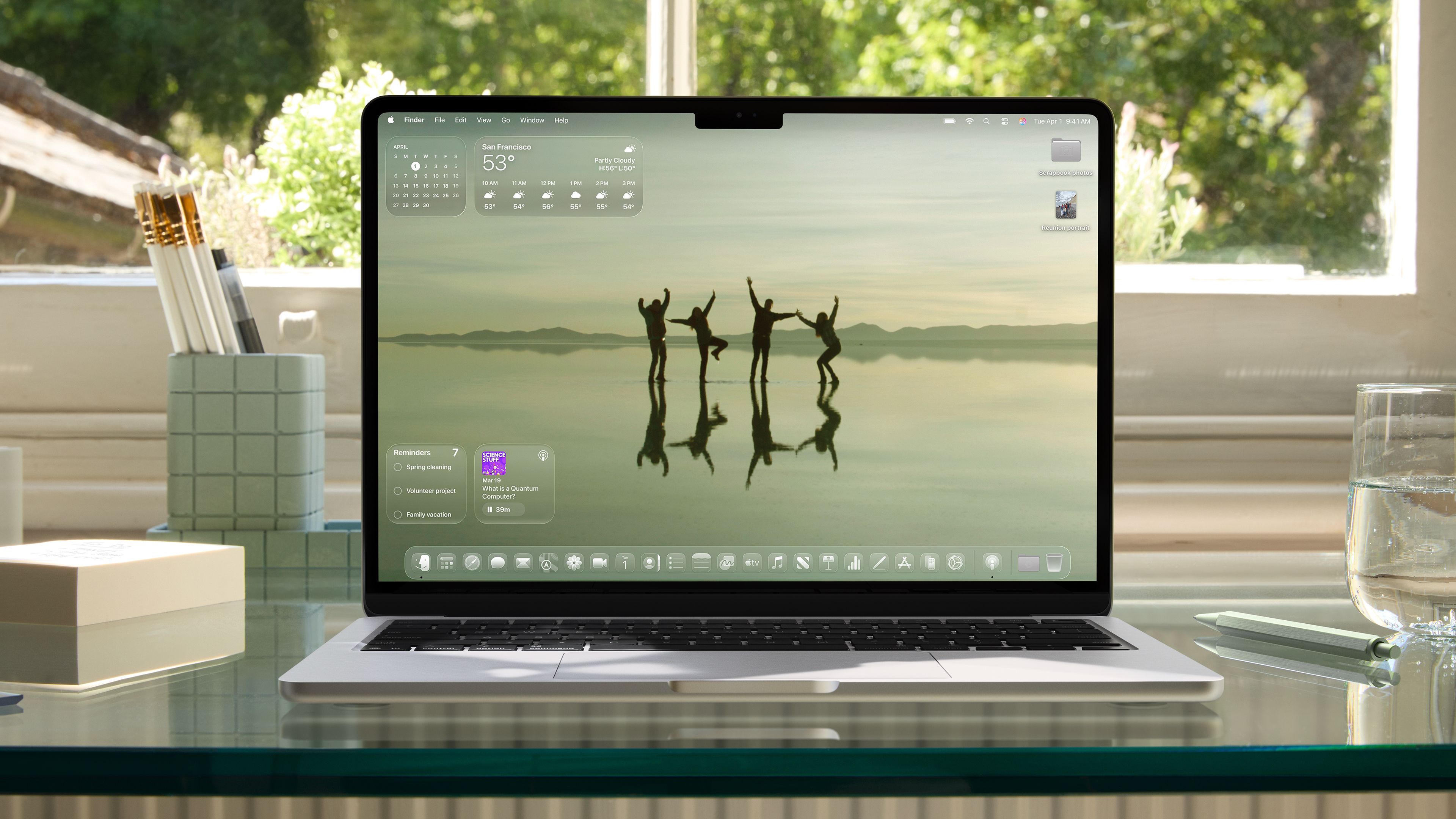
What stands out about this update is Dye's remark that Apple is "introducing a universal design across our platforms for the first time." A consistent design language will now be adopted across every device, from the iPhone to the Mac to the Apple Watch.
This can reasonably be seen as an attempt to extend the "spatial computing" worldview showcased in visionOS to existing devices as well. The likely aim is to strengthen the continuity of experience across devices, so that users intuitively feel they're within "Apple's world" no matter which device they're using.
A Thorough Refresh, from Icons to the Entire System
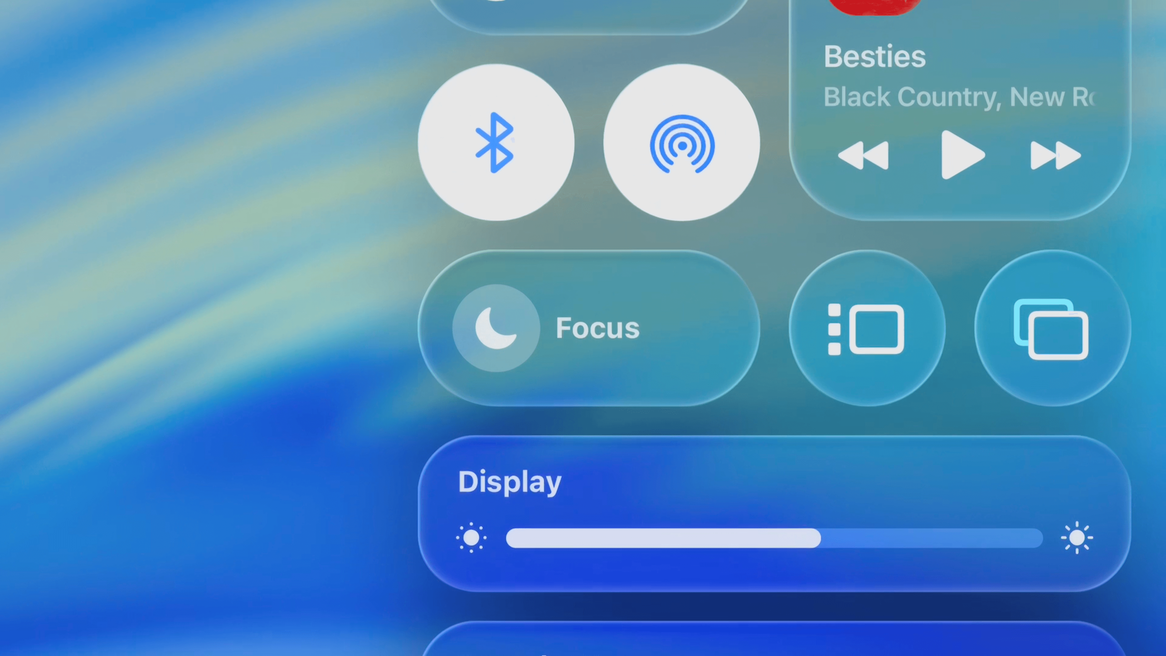
The changes reach every corner of the OS.
- Home Screen and Dock: App icons and widgets are now built from multiple layers of Liquid Glass, giving them gloss and a sense of depth.
- Controls and Navigation: Fundamental UI components—buttons, sliders, switches, tab bars—have all been redesigned.
- macOS Tahoe 26: The menu bar becomes completely transparent, giving the sense of a wider display. The Dock and icons gain greater customizability, offering light/dark modes plus colorful tints and an elegant "clear" look.
- Built-in Apps: Core built-in apps such as Camera, Photos, Safari, FaceTime, and Apple Music are all being refreshed with the Liquid Glass design.
Why "Liquid Glass" Now? — Decoding Apple's Strategy
Several intertwined factors appear to lie behind this large-scale design change.
New Frontiers of Expression Opened Up by Apple Silicon
The real-time rendering and dynamic light reflections that Liquid Glass achieves demand enormous computational power. The fact that this can now run smoothly across Apple's device lineup is a direct result of the improved performance of Apple's in-house chips—Apple Silicon—and the deepening vertical integration of hardware, software, and graphics technology. Technical maturity has made this new form of design expression possible.
A Stepping Stone Toward the Age of "Spatial Computing"?
This redesign is quite likely a stepping stone toward future form factors, such as AR glasses yet to come. In "spatial computing," which moves beyond the two-dimensional constraints of a screen to display information in three-dimensional space, elements like depth, translucency, and the interplay of light become critically important. Liquid Glass might be thought of as a design warm-up exercise for that coming era.
A Dialogue with the Past, and Competition with Rivals
In the history of technology, glass-like design is nothing new.
Mac OS X's "Aqua" Once Again? Does History Repeat Itself?
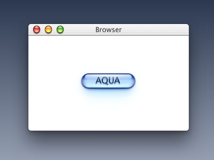
In the early 2000s, Apple adopted an interface called "Aqua" for Mac OS X. Characterized by a glossy, translucent look reminiscent of water droplets or jelly, this design became emblematic of the Mac at the time. Liquid Glass can be viewed as a reinterpretation of that same philosophy using modern technology.
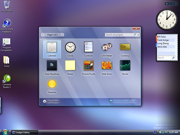
On the other hand, "Aero Glass," which Microsoft's Windows Vista adopted in 2007, demanded steep system requirements as the price of its beauty, and it became one factor behind that OS's performance issues. How smoothly Liquid Glass will run on older devices remains a point worth watching going forward.
Apple's Answer to Google's "Material Design"
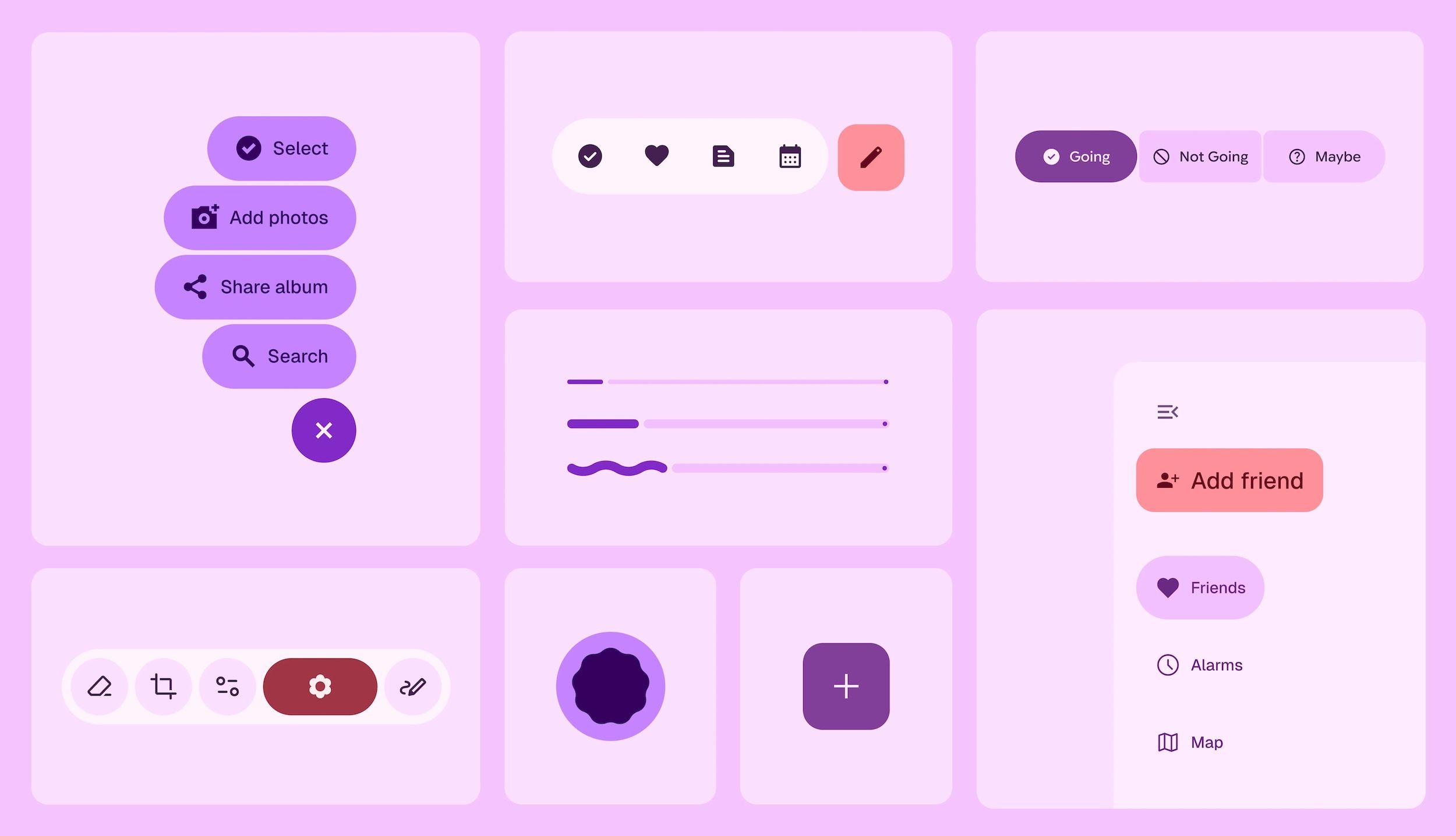
As it happens, this announcement came right after Google introduced the more expressive "Expressive" style into Android's design language, "Material You" (Japanese). Whereas Google pushes personalization forward using the physical metaphor of "paper and ink," Apple pursues a richer, more universal beauty and interaction model built on the metaphor of "glass and light." This could well become a new axis of competition between the design philosophies of the two mobile OS giants.
Changes Facing Developers and Users
Apple is providing developers with a new set of APIs for SwiftUI, UIKit, and AppKit, along with a new tool called "Icon Composer." With these, Apple says, developers will be able to easily adapt their apps to the Liquid Glass design.
At the same time, however, this means many apps will need to undergo substantial design overhauls. How developers respond to this shift will shape the quality of the app experience going forward.
For users, the look and feel of the iPhone they've known for years is about to change significantly. Whether this change is embraced as "delightful magic" or dismissed as simply an "unfamiliar change" will hinge on the quality of the experience Liquid Glass delivers—and on its performance. Since richer UIs tend to be more demanding on hardware, it will be interesting to see how it actually feels to use.
Source